I’ve been getting lots of questions lately about how to get started in designing fabrics, so I thought I’d share some pointers for anyone looking to get into it. I don’t claim to be an artist or an expert, but in this blog series I’ll be sharing what I’ve learned from years of studying, reproducing and creating fabric designs.
Let’s start with the basics. Before you even put pen to paper (either literally or digitally), there are a number of key factors to consider when you’re planning out your design. Your decisions will largely depend on the intended end-purpose of your print (clothing or quilting? Wallpaper or tea towel?) along with your own tastes and preferences.
Directionality
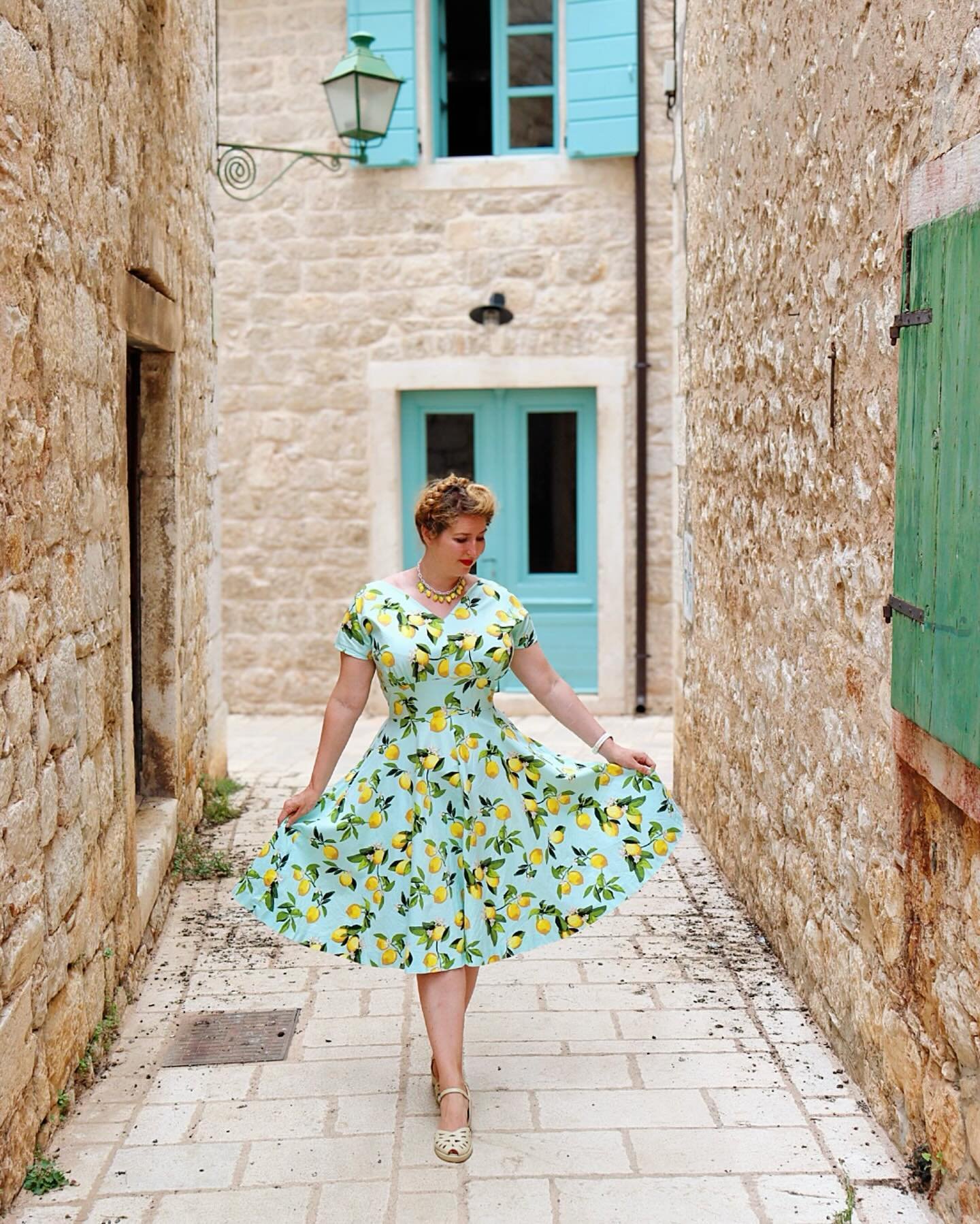
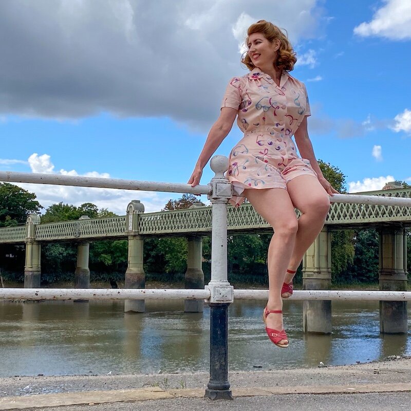
This refers to whether or not your design has a right way up - or, to put it another way, a wrong way up. If you’re designing wallpaper, you know it’s going to be hung on a wall in strips, and you know very few people are ever going to be hanging upside down on the ceiling to view it, so it makes sense that design elements have the same ‘up’. If you’re designing for a dress fabric, on the other hand, you may wish to consider other options. Directional prints follow the grain of the thread, so will fall differently in bias-cut or circular garments - some interesting effects can be achieved with this.
1-way directional
1-way directional prints have a right way up and a wrong way up. This means that if you’re cutting out the pieces for a dress, all the pattern pieces have to be facing the same way, which may require extra fabric. Border prints are 1-way directional, but on a large scale, so the design is set to fit the full selvedge-to-selvedge width of the fabric, and repeat along the length.


2-way directional
There’s a definite direction to the print (it doesn’t look the same at all angles), but the ‘right way up’ flows both ways. In its simplest form, this is a stripe, which provides scope for interesting effects by using the orientation of the pattern in different ways (horizontal, vertical, bias).


Scattered, organic or non-directional
Regardless of which way you look at the print, some elements will appear upside down or sideways and others will be the right way up. This makes the print very versatile for sewing clothing, as it means that fabric can be cut economically for less wastage.


Scale
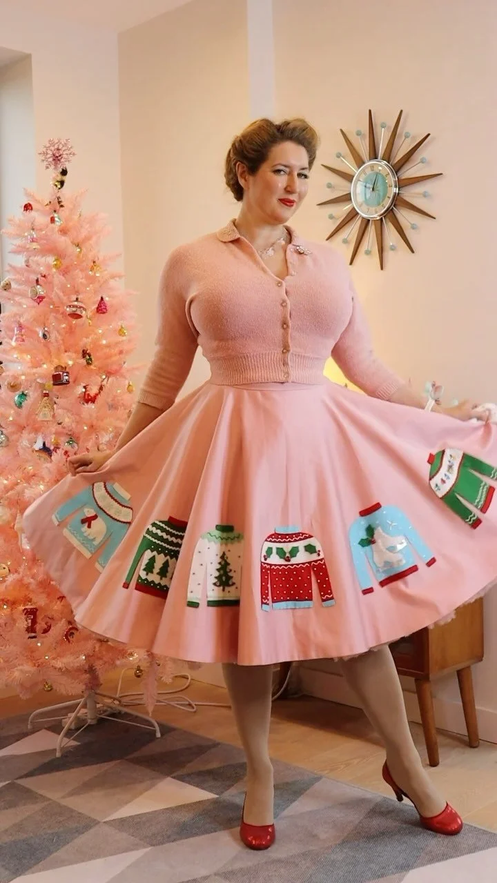
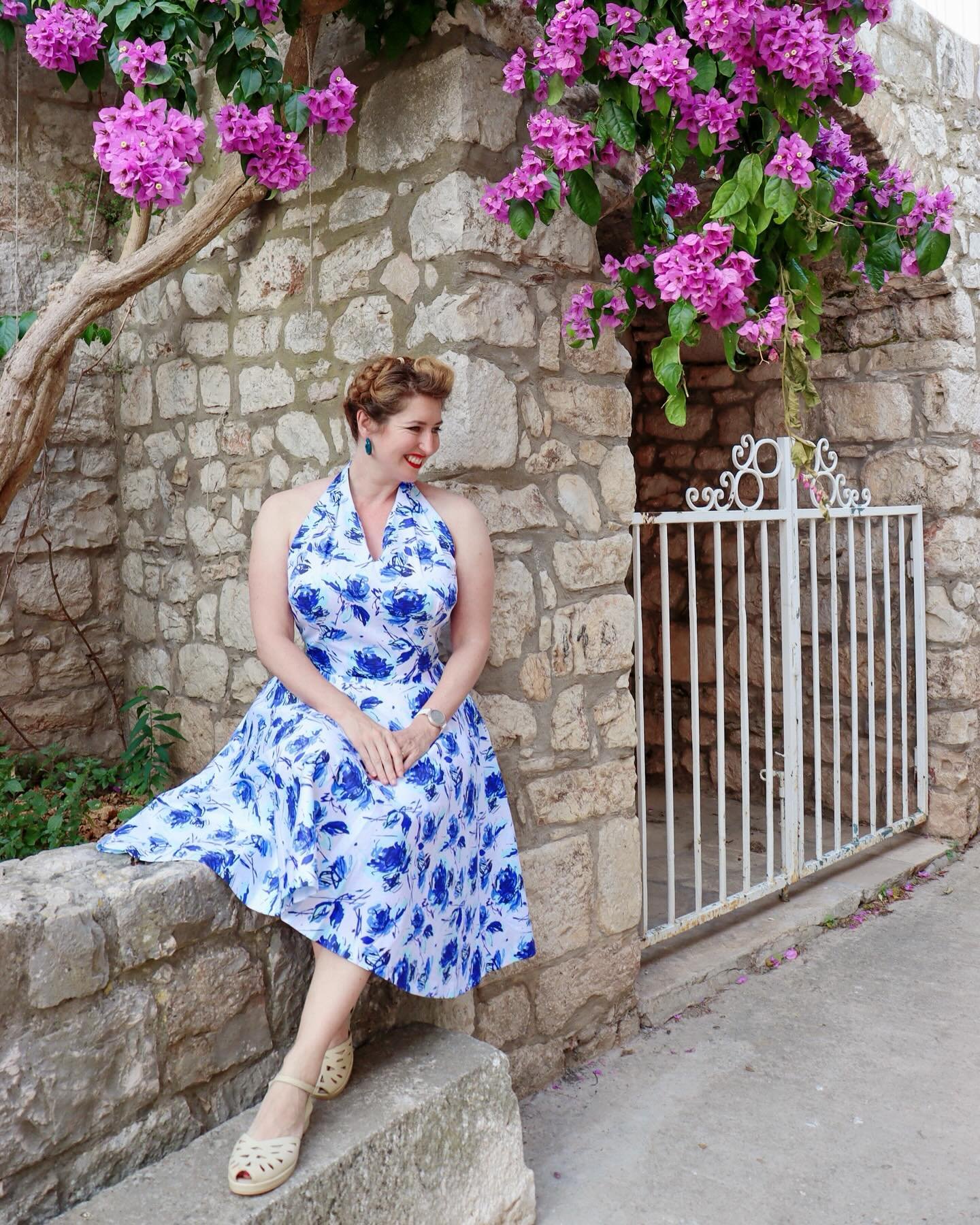
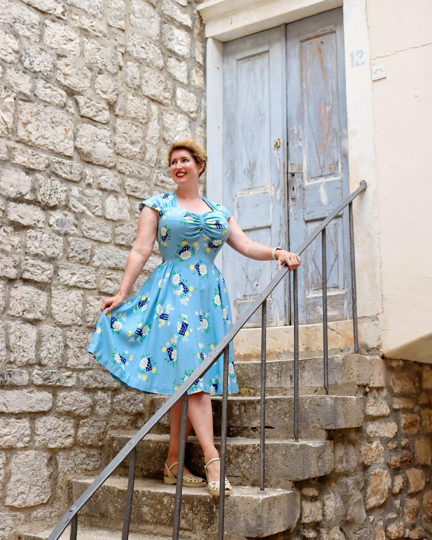
Generally speaking, the scale of a print should match the scale of the end product - a design intended for doll clothes will have smaller elements than, say, one created to wallpaper a ballroom.
Prints designed for apparel can of course run the gamut from ditsy to large scale, so it’s a matter of personal taste and the desired look. I like quite bold, dramatic prints so I often design on a medium-large scale.
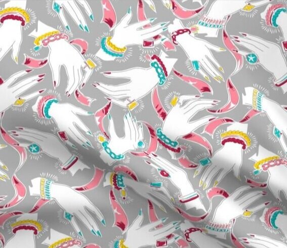
Density
This concerns the ratio of pattern elements to areas of solid colour, not to be confused with low-volume prints, which refers to low colour contrast within the design.
When considering pattern density, you’ll want to take into account the intended purpose of the design. For example, quilting fabric tends to be fairly high density with minimal white space, to ensure that even the smallest segments of a patchwork block contain pattern. Dress fabrics, on the other hand, sometimes have more breathing room around the design elements so they stand out against the background.


While they’re designed on a similar scale, these two designs have very different density - the whole surface of Colourful Dancers on the left is densely packed with swirls and squiggles, while there’s a lot more visible background on Hazel Scott Floral, on the right.
Pattern Repeat
Designing a seamless repeat is, of course, one of the key parts of designing a pattern for fabric. While you can just create a pattern design with one or two elements just repeating across the fabric, for the design to flow it helps to have elements overlapping the edge of the repeat area to ‘blur’ the edges of your tile and avoid a grid effect of white space between the repeats.
If you examine vintage fabric designs you will often find that the pattern repeat is in a diamond shape rather than a square, with the repeats forming a zig zag across the fabric. To create these repeats, the tile is shifted along half its length for each row (half-brick repeat) or column (half-drop repeat), in the same way bricks are stacked to build a wall. This is effective at further disguising the edges of the tile and creating a more dynamic, undulating feel to the design.

Example of a basic repeat: Santorini Architecture

Example of a half-drop repeat: Butterfly Mail
I almost always design with a half-drop repeat. Santorini Architecture is a rare exception, but because of the large scale and repeat size it avoids having too obvious a grid effect.
Coming up in part 2
I hope part 1 of this Fabric Design Primer was helpful! In the next post in this series I’ll talk about balance and flow within a design and share my top tips for successful patterns.