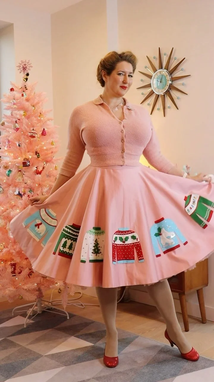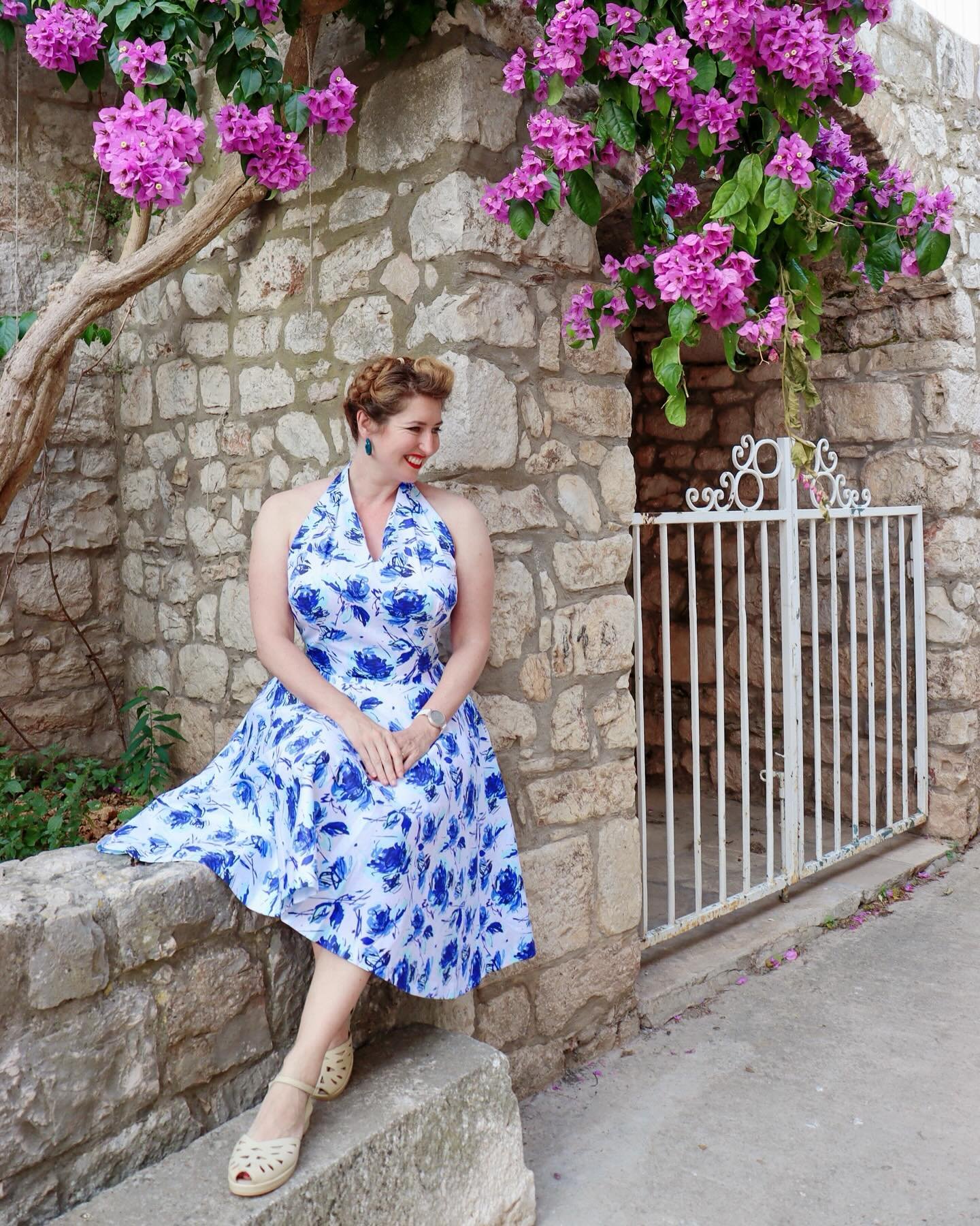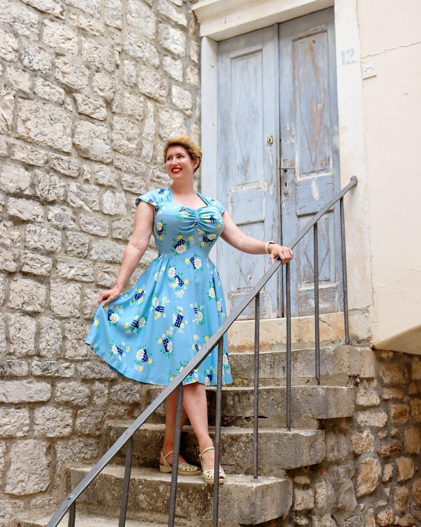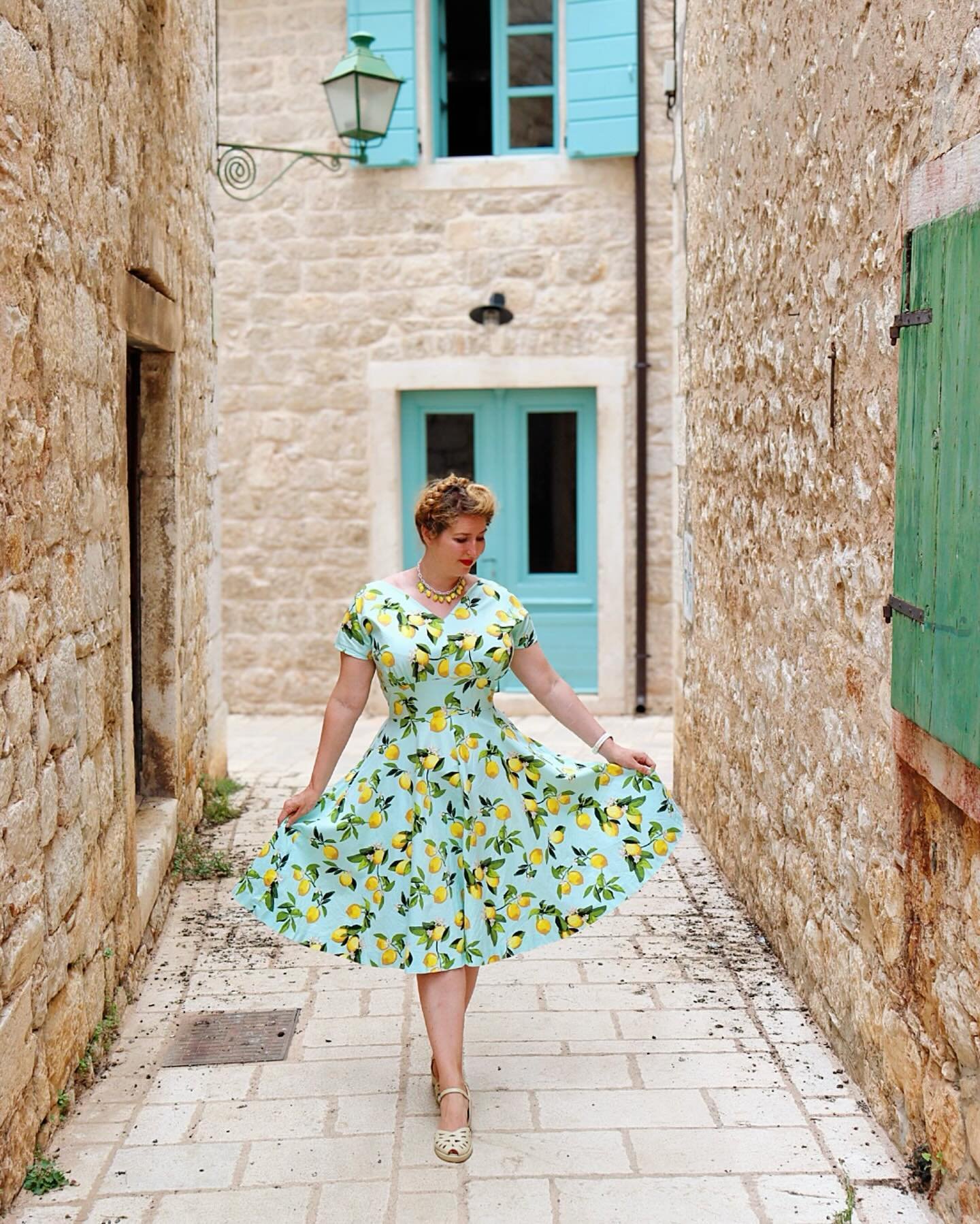
Colour gives me life. So much of the available reference material showing fashions from the early to mid part of the 20th century - such as photographs, magazines and catalogues - are in black and white, but life was colourful! I love discovering the colour palettes that were around back then, colour-printed style features; the advice in magazines on the latest fashionable colour combinations; and “this year’s colours” in mail order catalogues. I’m reviving a series of posts from the Tuppence Ha’penny archives - and updating and expanding them - exploring colour theory and colour palettes, with colourful inspiration from the 30s, 40s and 50s.

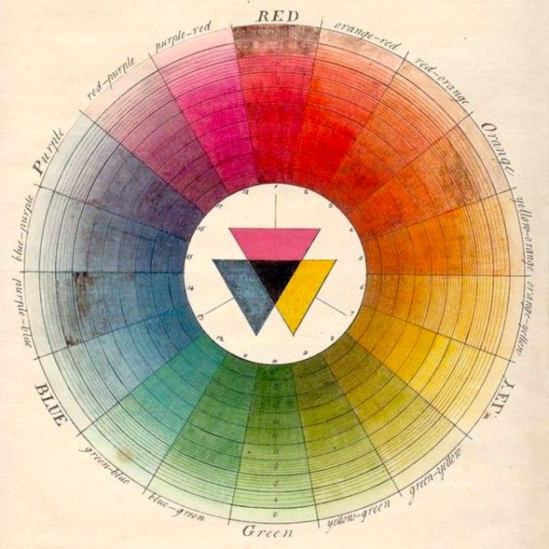
Boutet’s 7-colour and 12-colour wheels from 1708 Source: Wikipedia
Colour theory: The colour wheel
Primary, Secondary and Tertiary colours
For the purposes of fashion, the primary colours are red, blue and yellow, and form an equilateral triangle on the colour wheel. Mixing any two of these gives the secondary colours: purple, green, orange. In turn, combining a secondary with a primary gives a tertiary: red-orange, yellow-orange, and so on.
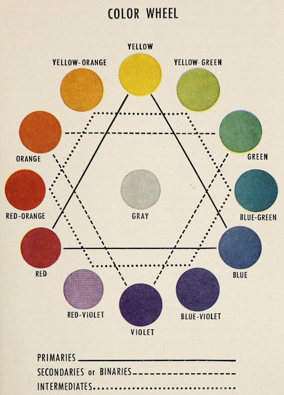
From Today’s Clothing, 1949
Colour Terms: Hue, Saturation and Value
Hue is the actual "colour" of a colour - its position on the colour wheel.
Saturation refers to how pure or intense the colour is. Vibrant colours are highly saturated, and colours with low saturation appear "muted". Variants in saturation are called tones of the same colour - sage is a tone of green, for example.
Value refers to the relative lightness or darkness of a colour. If a colour is made lighter (by adding white) the result is called a tint, and its value is high. If black is added to make the colour darker, this is called a shade, and has a low value.

Wilhelm von Bezold's 1874 colour wheel illustrates shades and tints
Types of Colour Scheme

Charlotte Rankin Aiken writes on colour harmonies in her Department Store Merchandise Manual for Millinery, Colour harmonies:
Harmony in the combination of colours may be of two kinds:
Harmony of contrast (complementary or split-complementary colour schemes)
Harmony of analogy or likeness (monochromatic or analogous colour schemes)
Harmony of contrast is between colours which are most unlike each other. it is perfect when the colours are complementary. Blue and orange, or red and green, are perfectly harmonious, one of the reasons for the pleasant sensation being that each one deepens the colour of the other and makes it purer. the true contrasting colour of any colour may be found by following the cross lines in the colour wheel. the harmony of complementary colours is very bright if the colours are in full intensity. Greyed or broken tones make a quieter harmony.
Harmony by contrast may also be secured with the hues on each side of the complementary colour, as blue with red-orange, or yellow or red with blue-green or blue-violet.
The harmony of analogy or likeness is between colours of the same or related colour scales. They may be:
Different shades or tints of the same scale, as light red and dark red
Different hues of the same colour, as blue-green and yellow-green.
The first is sometimes called a monochromatic or self-colour harmony. The tints or shades combined should have enough variety to be distinct, but should not be so different as to lose their likeness and form a harmony of contrast.
A dominant harmony may be formed by the use of a number of hues of the same colour, as yellow-green, grey-green and blue-green, which blend because green is dominant.