Introduction to Colour Theory

Introduction to Colour Theory

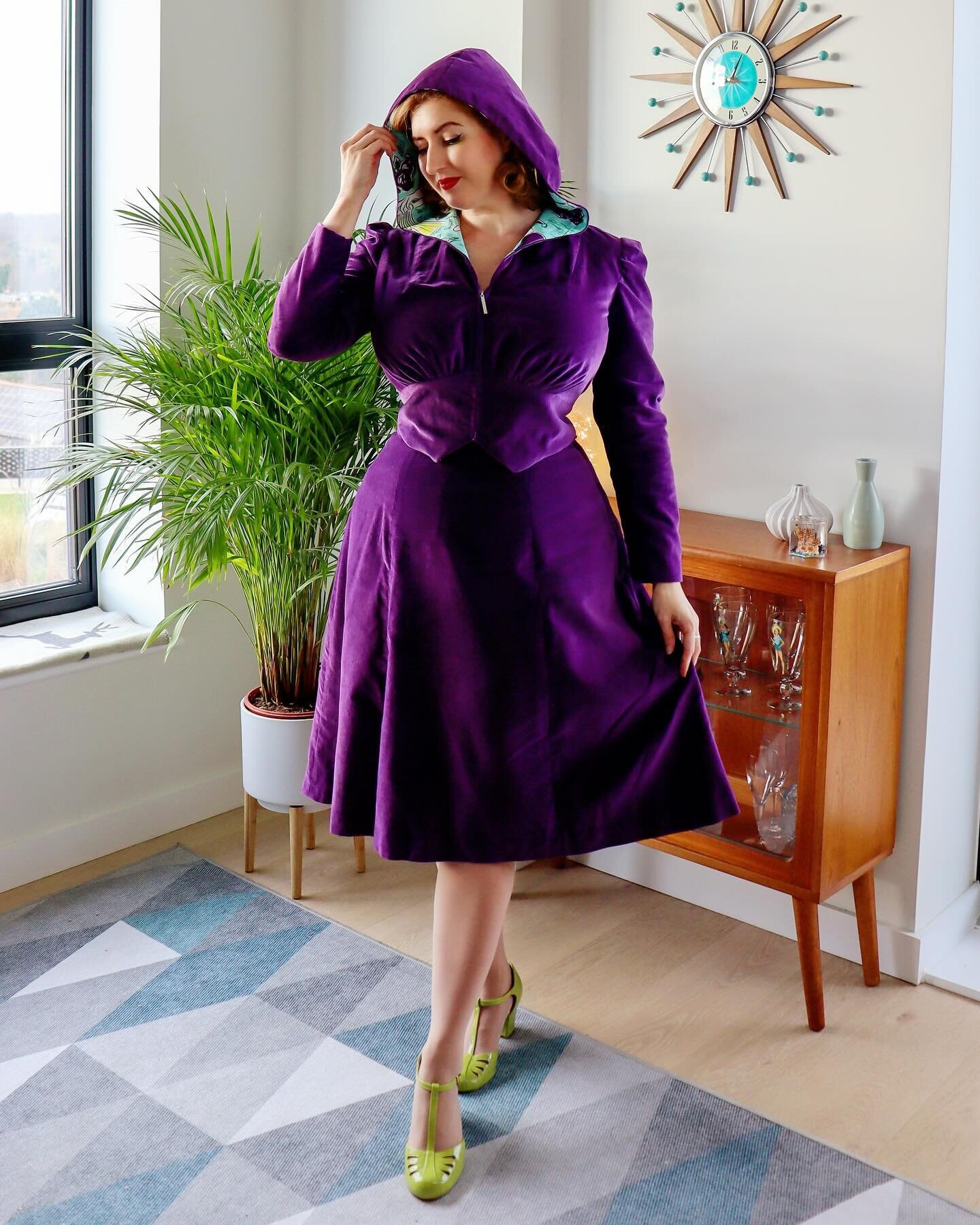
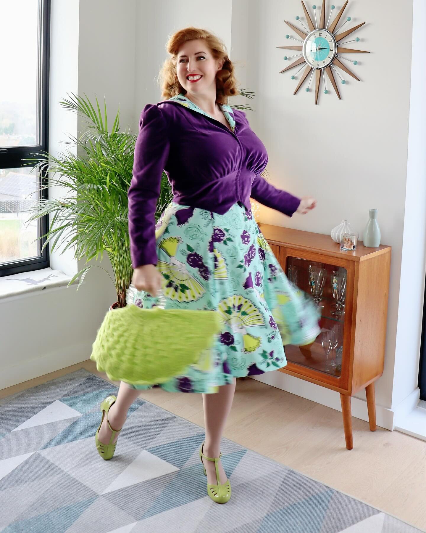
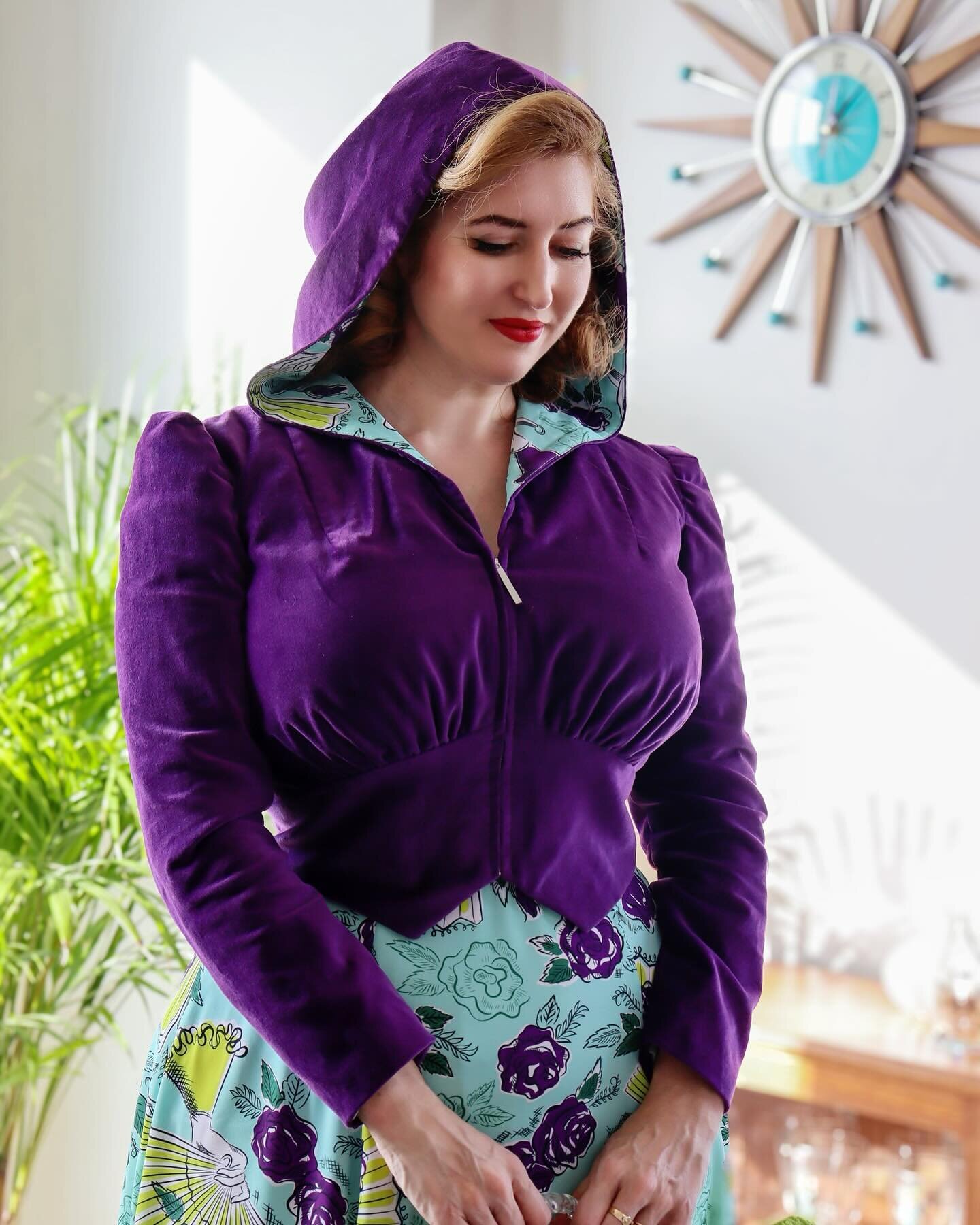
Colour gives me life. So much of the available reference material showing fashions from the early to mid part of the 20th century - such as photographs, magazines and catalogues - are in black and white, but life was colourful! I love discovering the colour palettes that were around back then, colour-printed style features; the advice in magazines on the latest fashionable colour combinations; and “this year’s colours” in mail order catalogues.

Put Your Best Face Forward (Yardley 1942-43)

Put Your Best Face Forward (Yardley 1942-43)

Yardley ran this series of wartime adverts over 1942/3. Each shows a woman engaged in "war work" - Wren, factory girl, nurse - and a patriotic message encouraging women to "work hard and let no weariness appear". The superficial read of course is that a woman’s duty above all is to be decorative — but, if you look at it a bit deeper, what intrigues me about this campaign is the focus on a specifically feminine strength.

Going Green

Going Green

I'm currently participating in #thevintagefashionchallenge on Instagram; this week's themes are colour-based, so this morning we made an early morning visit to Kew Gardens for a green-themed photo shoot. This dress was a charity shop score - it's a modern LK Bennett in silk jersey; I just couldn't resist the novelty key print, especially as at the time I was trying to incorporate more green into my wardrobe. Although it's clearly not true vintage or repro, the silk jersey is amazingly comfortable and I think it styles as vintage quite well.