Decades before Pantone’s colour of the year, the Textile Color Card Association (TCCA) led the way in the standardisation of colours and colour names. Established in 1915 in response to disruption to the French fashion industry and supply chain during the First World War, the TCCA provided American textile industry and dealers with “indispensable guidance in the manufacture and ordering of colours.”
The American textile and garment industries had for decades relied on the fashion capital of Paris for style guidance and imported French shade cards. But the First World War, had effectively stifled the famous Paris fashion industry and its global influence, and cut off supplies of European dyes. This, however, “forced a solution of the constantly recurring problem of fixing uniform shades of colour with the seasonal changes of fashion,” noted one writer in 1934. TCCA members from millinery companies, textile mills, and retail firms collaborated to create the Standard Color Card of America.
"The Standard," as it was called, was designed to have a lifespan of several years; it was used by clothing designers to order matching fabrics, buttons and thread, or by millinery buyers to specifiy the precise colours of ribbons, feathers and other ornaments. By matching to the shade specified on the card, disparate suppliers were able to provide colour consistency to their clients. "The great vogue of the ensemble", one stylist remarked in 1924, "has drawn us all together more closely and we are trying to match up everything, hats, coats, and all these things" (quoted in The Color Revolution).

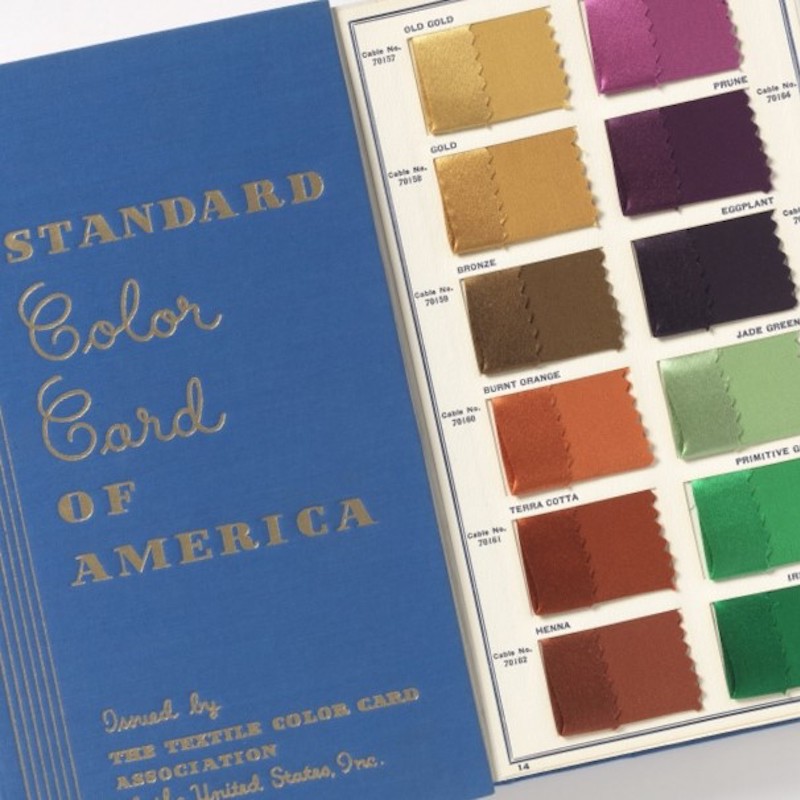
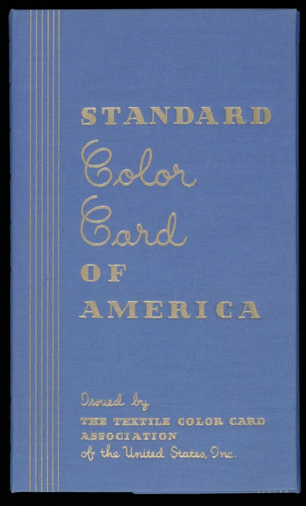
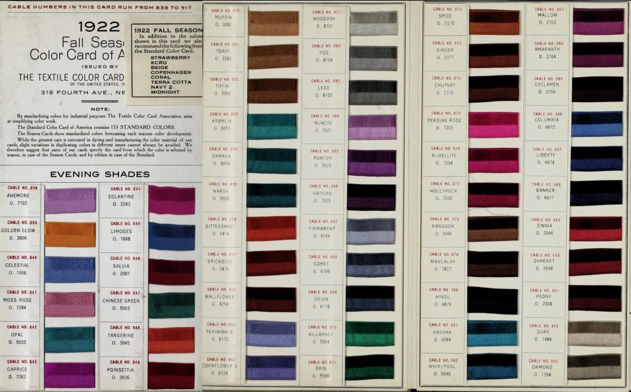
Standard Color Card of America, 6th edition (1922), issued by the Textile Color Card Association of the United States
Image source: Archive.org
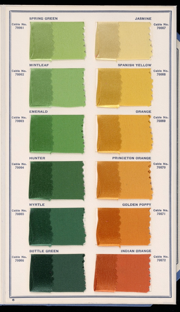
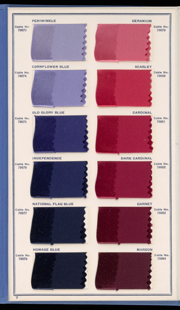
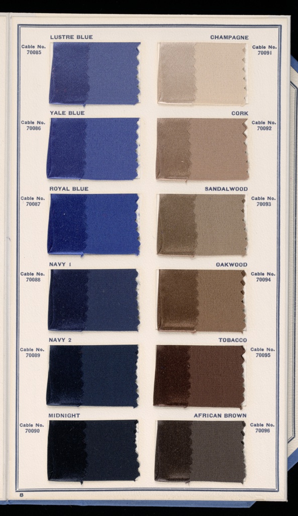
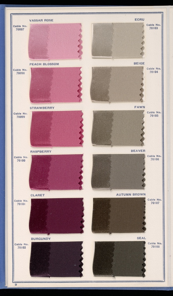
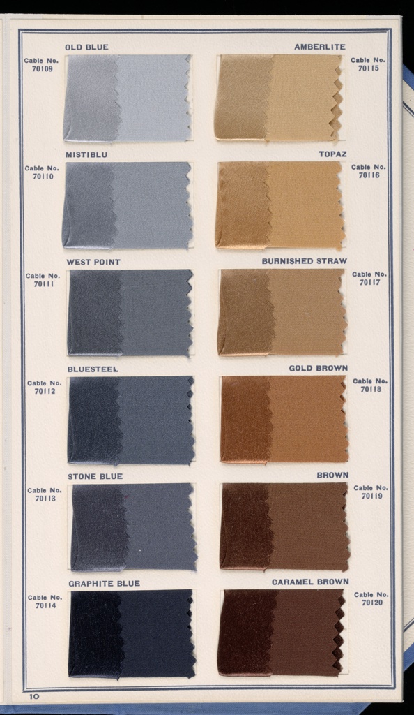
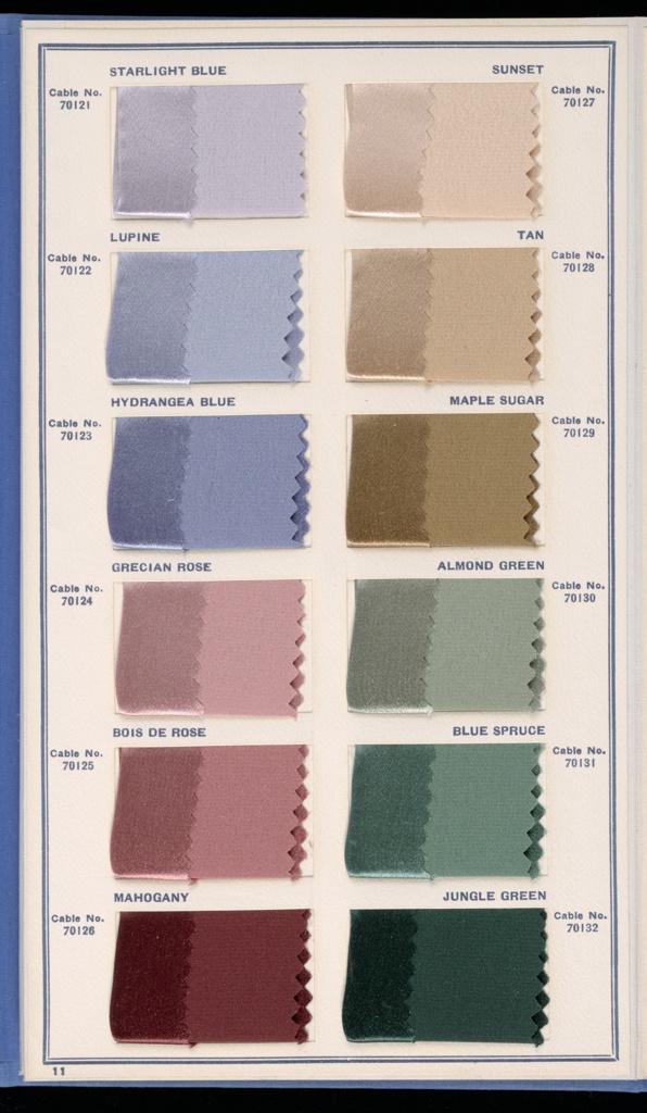
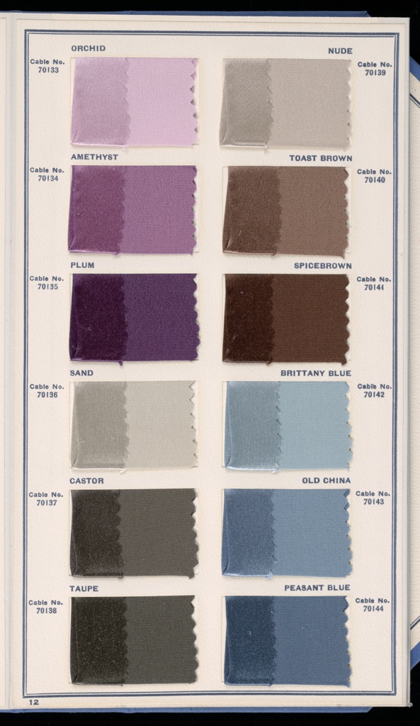
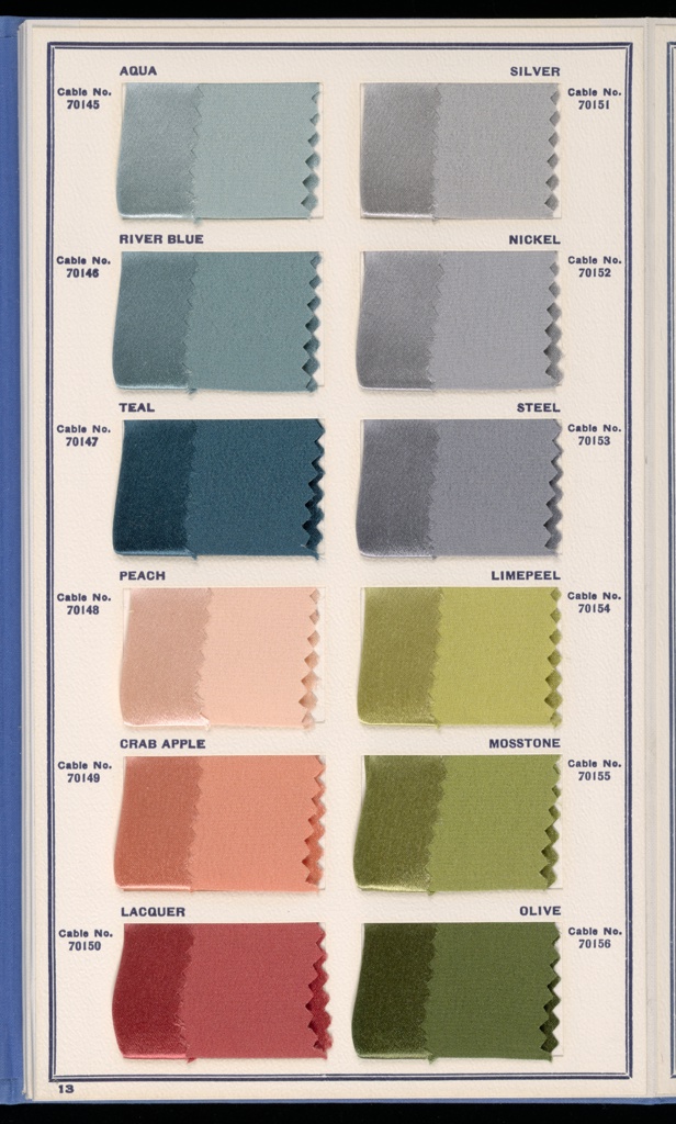
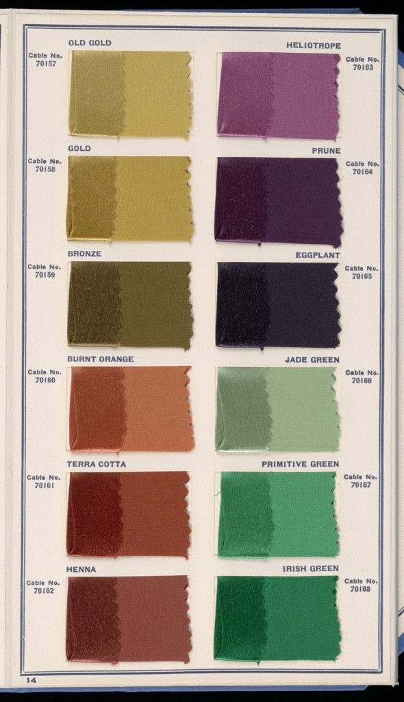
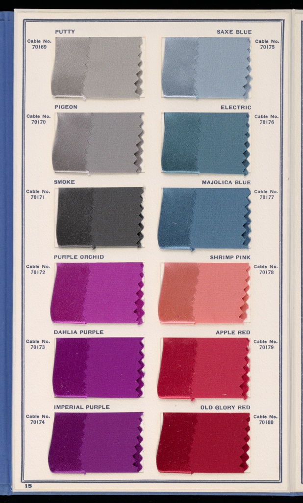
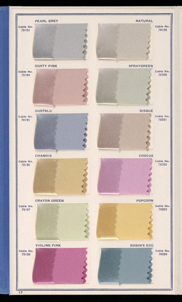
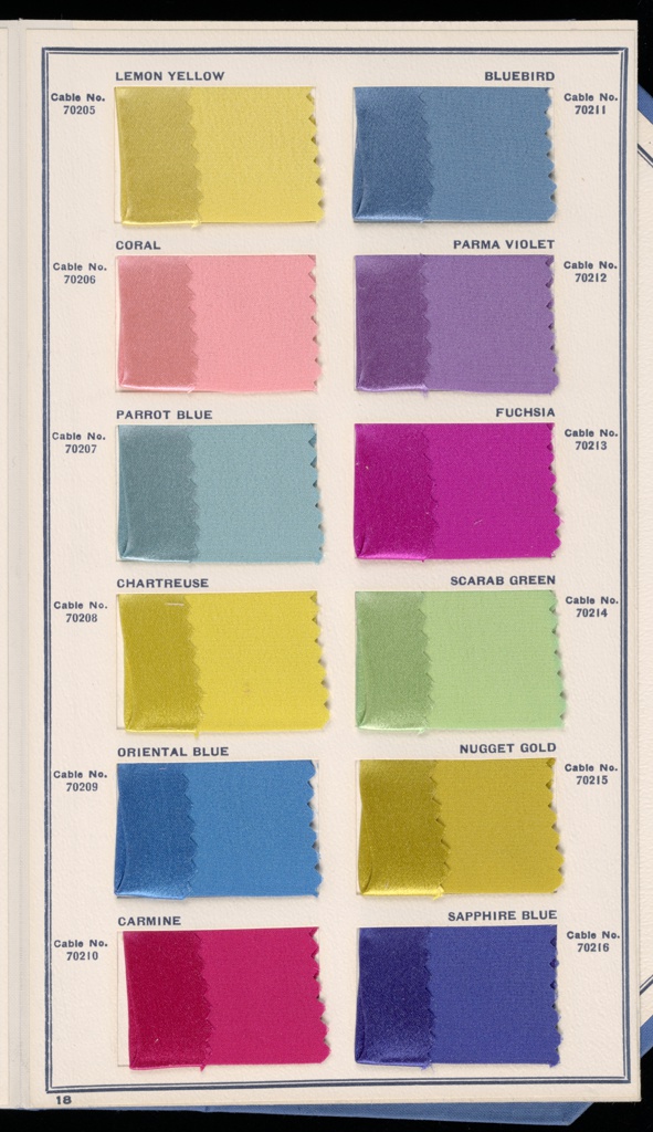
Recognising that dye colours can appear differently depending on the surface to which they are applied, the TCCA dyed swatches of silk satin, with both the gloss and matte side shown for ease of matching on different materials and finishes. Although each edition made tweaks, the staple colours in The Standard were fairly constant, and indeed a large proportion of the original colour names found in the early cards can be found in the current edition, published in 1981.

Standard Color Card of America, 9th Edition (1941), issued by the Textile Color Card Association of the United States
Images source: Cooper-Hewitt Museum
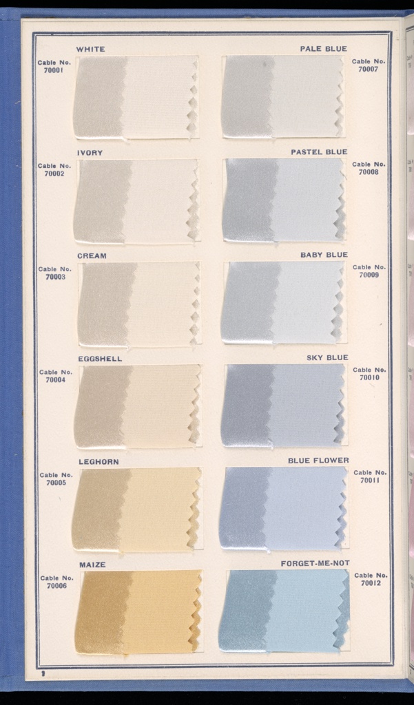
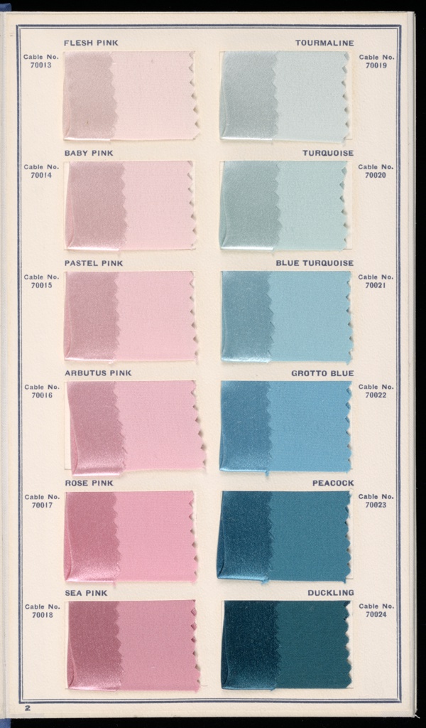
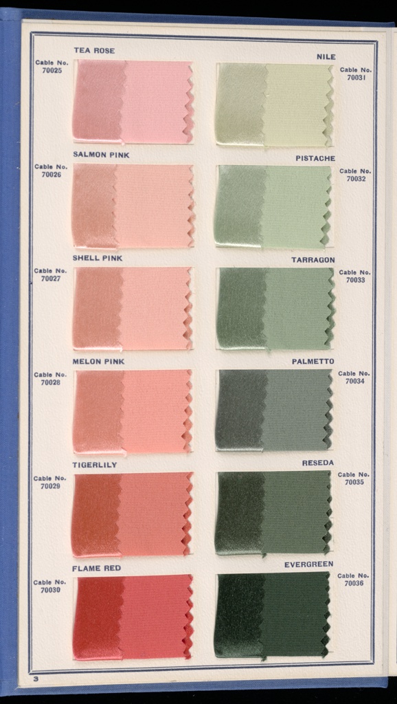
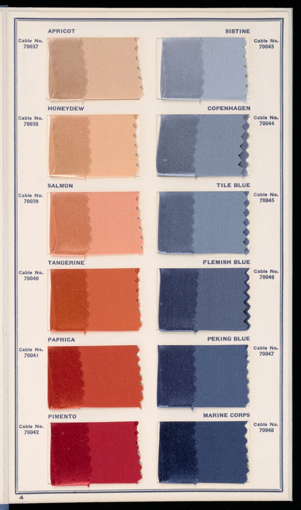
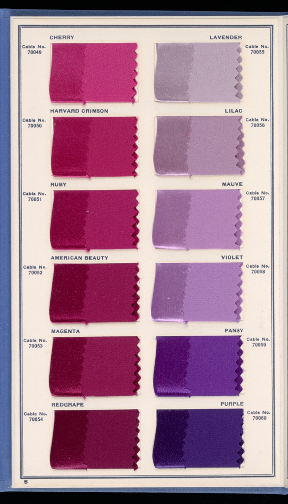

As a further aid to manufacturer, retailer and consumer, the TCCA assigned to each colour a four-digit number describing its hue and lightness. “The first, second and third figures indicate the relative proportions of the component parts of a colour. Thus, the first figure indicates the principal colour on which the shade is based, the second the principal blend, and the third the secondary blend,” explained Mary Brooks Picken in The secrets of distinctive dress in 1918.

Image source: Archive.org
The seasonal trend forecast
Shortly after its inception, in around 1916 (sources differ) the TCCA issued its first colour trend forecast, featuring 40 colours for the upcoming spring season, presented in silk and wool swatches. This initial edition was designed by a committee of TCCA members and was based on Paris colour cards that had made it across the Atlantic, along with a careful analysis of patterns in domestic sales.
1922 Fall Season Color Card of America, issued by the Textile Color Card Association of the United States
Image source: Archive.org
The trend forecast went from strength to strength, and although the Paris fashion scene recovered following after the war, the TCCA’s forecast was by then firmly established in the American textile industry, with its mission to champion “American colour for the American People" (The Fashion Forecasters). Seasonal forecasts were promoted with press releases written by managing director and forecaster-in-chief Margaret Hayden Rorke, with lavish descriptions of the tones featured. Seasonal cards also sometimes included suggestions on how to mix and match hues to create fashionable colour harmonies in analogous or complementary schemes.

1939 Fall Season Color Card of America, issued by the Textile Color Card Association of the United States
Image source: The Fashion Forecasters
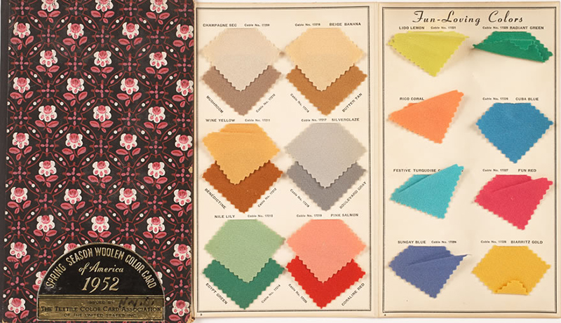
Spring season color card of America 1952, issued by the Textile Color Card Association of the United States
Image source: FIT Newsroom
Capturing the Zeitgeist
Seasonal colour forecasts also reflected cultural zeitgeists, art movements and world events. Writing in 1936, one fashion editor noted that “Shades sponsored by the Textile Color Card Association are inspired by a recent exhibition of Gauginʼs work, depicting Tahitian scenes. Consequently, the brilliant hues and striking contrasts of the tropics will be featured in the new season. The glowing shades of flowers are expressed in sun orange and Nassau yellow; the intense blues of sunlit seas in grotto blue and electric; and the burnished skin tones of natives in bronze and maple sugar”. The fall 1941 collection referenced an “All-American” sporting theme, featuring trophy gold, hockey blue, polo rust, cross-country green, racing purple, champion blue, horseshoe red, sailing blue, varsity rose, and ski green. The card was one that included a guide with suggestions of co-ordinating ensemble colours.
"New quirks in colour may be found anywhere," Margaret Hayden Rorke was quoted as saying in 1940, "in news events, history, art or music. For instance, our Coronation series of patriotic British colours in 1937 followed the coronation of King George VI. We predicted the popularity of vivid South American reds and yellows with our Pan-American card when the President made his goodwill advances to South America in 1938. The 'Down Rio Way' group just out was founded in the enthusiasm for South American music with such shades as Rhumba Rose and Tango green."
The Second World War strongly influenced the TCCA’s forecasting. In 1940 Mrs. Rorke said that “Vivid shades were needed to counterbalance the sobriety in the air.” Two years later, the colours of 1942 purported to be chosen to help the War Effort. As the article explained: “Wartime conditions have reduced America’s collection of colours for woollen goods to 22 shades as compared with the 40 to 60 colours in previous seasons. Grouped under the heading of United Victory Colours, the new shades have been issued by the Textile Color Card Association of the United States in co-operation with the War Production Board.”
The shade card namechecked the Allied nations with colours including Australian Green, British Rose, Dutch Tan, Pan-American Red, and India Copper; unsubtle patriotism infused other colours such as Honour Gold, Valour Red, and Patriot Green; themes drawn from the military and theatres of war also feature in Gunpowder Grey, Salute Blue, Air Grey, Atlantic Sand, and Pacific Green.

1942 Fall Season Woollen Color Card of America, issued by the Textile Color Card Association of the United States
Image source: The Design Centre
The patriotic theme continued after the war with the TCCA’s collection for spring, 1946. As reported by as Arthur Abbott in The Color of Life, the collection featured “the triumphant theme of Victory and Peace by means of colours of freedom. These brilliant colours include hope turquoise, Pacific lime, orange glory, peace blue, brave red, triumph gold, gallant coral, victorious blue, valour rose, and heroic green.”
The trend forecasts became ever more specific, with dedicated reports describing colours destined for silks, gloves, hosiery, shoes, bags, millinery and even fur.
The Broadcast
The Broadcast, the TCCA’s bulletin for subscribers, fashion papers and trade associations, was launched in 1926 to provide up-to-the-minute debriefs of the latest developments from Paris. Mrs. Rorke and her team needed to keep up to date with influences on fashions — from the Paris showrooms to celebrity weddings. In 1922, the marriage of HRH Princess Mary, daughter of King George V, sparked a craze for the signature colours used in her trousseau: a shade of larkspur or powder blue — quickly christened Princess Mary Blue by the press — along with mauve and grey.
The TCCA started including in their bulletins illustrations of the colours worn by celebrities and personalities — an invaluable aid in the era of black and white photography both to reporters and to the consumers who might look to emulate the styles of those they admired. This edition of the Broadcast informed subscribers of the colours that Eleanor Roosevelt would be wearing at the third inauguration of her husband, President Franklin Delano Roosevelt, on January 20, 1941: Rose white satin with matching gloves for the evening gown; Vermilion wool for the inaugural ceremony; and a shade of grey-blue for the afternoon reception.

Image source: The Fashion Forecasters
Trailblazers
The TCCA described itself as the trailblazer of "the modern approach to the merchandising of colour in our every day business life." The organisation also provided opportunities for trailblazing female entrepreneurs. As a new profession, the colour trade was a rare field where women could flourish. Gender stereotypes created ways for women to work in roles that connected colour, commerce, and fashion: it was scientific fact that women were less likely to be colourblind than men, and it was culturally believed they had greater sensitivity to colour's emotive qualities. A former actress and suffragette, Margaret Hayden Rorke harnessed gender biases to craft a long professional career for herself in the New York fashion industry as managing director of the TCCA from 1919 to 1954. Such was the influence of the TCCA’s trend forecasts that “Rainbow Expert” Rorke was described in 1936 as “America’s uncrowned queen of colour — for it is she who tells, often a year in advance, just what colours American women will wear”.