{Fabric of Time: Rayon} Part 1: Early Development
Decades before Pantone’s colour of the year, the Textile Colour Card Association (TCCA) led the way in the standardisation of colours and colour names. Established in 1915, the TCCA provided American textile industry and dealers with “indispensable guidance in the manufacture and ordering of colours.”
Today is “Blue Monday” - so called because of a pseudoscientific calculation that it is the most depressing day of the year: Christmas is a fading memory, the days are short and grey, everyone’s still broke and payday is still a week away. Along with many others, I experience Seasonal affective disorder, so to combat the instinct to hibernate the month away, I like to focus on planning and action, looking forward to the year ahead. I know that resolutions aren’t for everyone, but I find setting out plans and goals to be a really positive exercise for me.
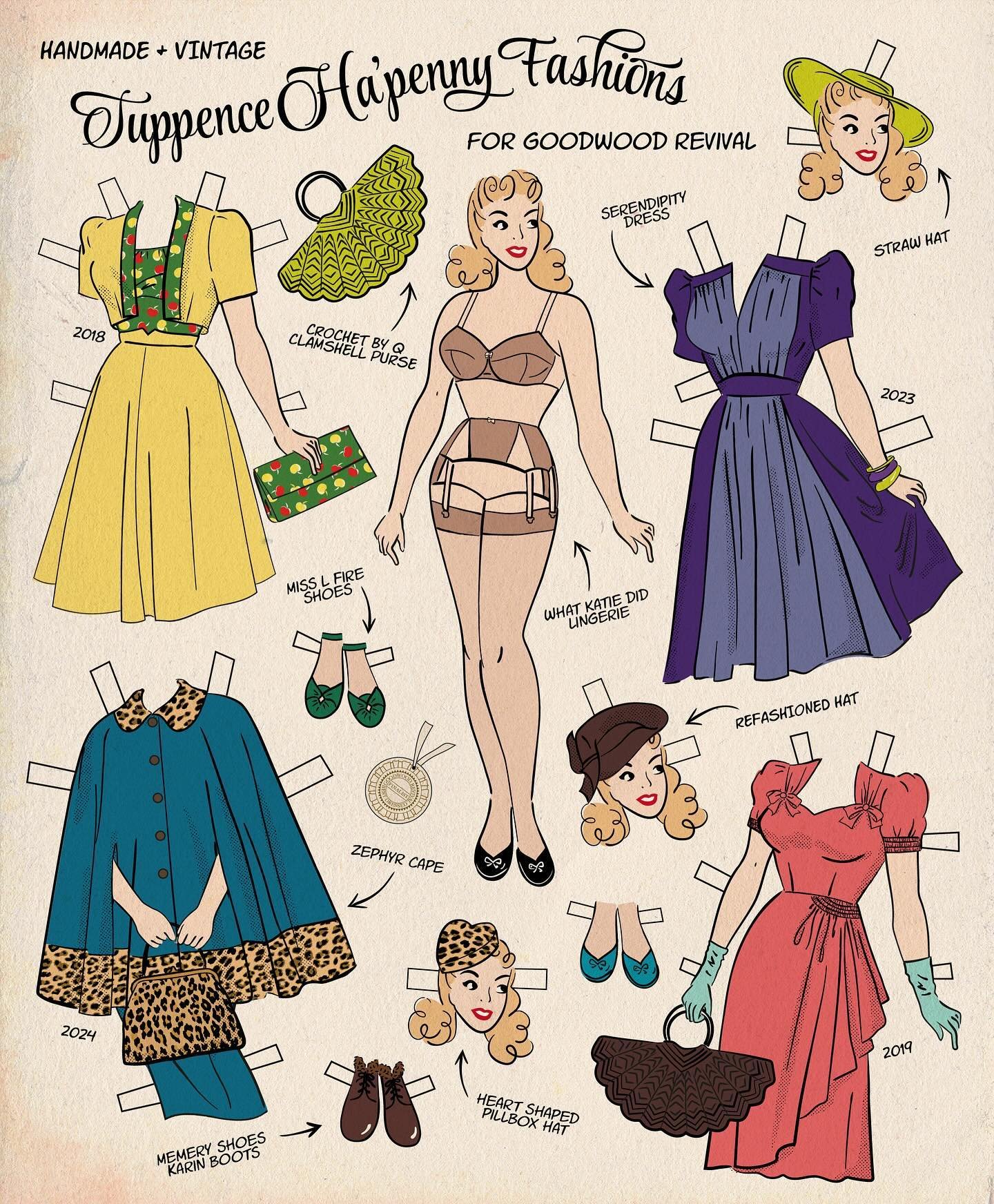
One from the archives! I first published this post back in 2011, and it proved one of my most popular reference posts, and my most pinned/reposted images and content. My original aim was to provide a quick-reference guide to the key features of 20th century fashion eras to illustrate the evolution of style through the years, and to encourage a system of categorisation thinking outside the decade-by-decade box.
Colour gives me life. So much of the available reference material showing fashions from the early to mid part of the 20th century - such as photographs, magazines and catalogues - are in black and white, but life was colourful! I love discovering the colour palettes that were around back then, colour-printed style features; the advice in magazines on the latest fashionable colour combinations; and “this year’s colours” in mail order catalogues.
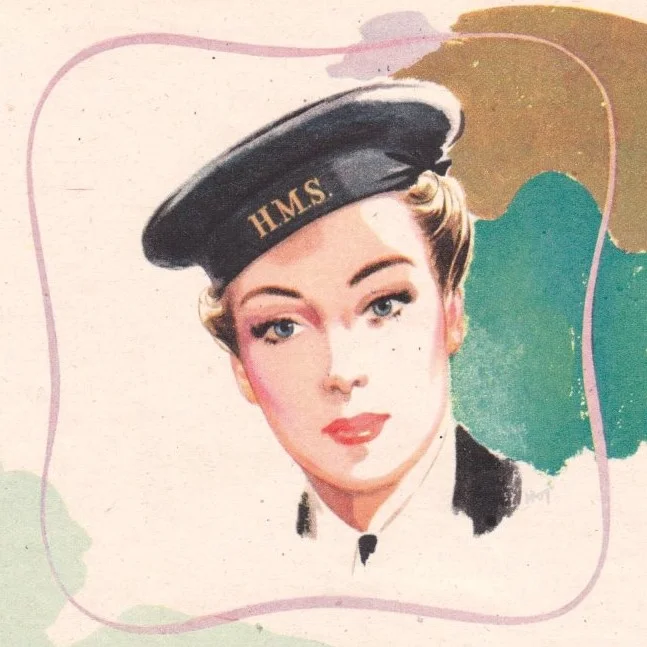
Yardley ran this series of wartime adverts over 1942/3. Each shows a woman engaged in "war work" - Wren, factory girl, nurse - and a patriotic message encouraging women to "work hard and let no weariness appear". The superficial read of course is that a woman’s duty above all is to be decorative — but, if you look at it a bit deeper, what intrigues me about this campaign is the focus on a specifically feminine strength.