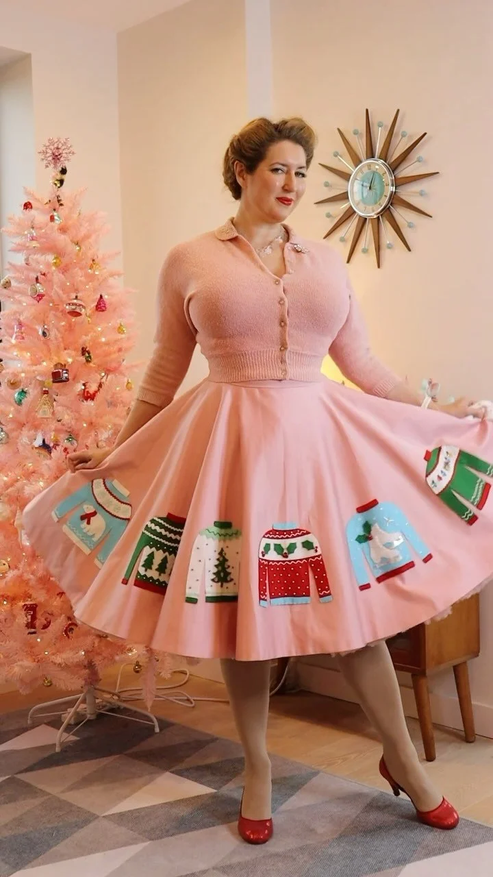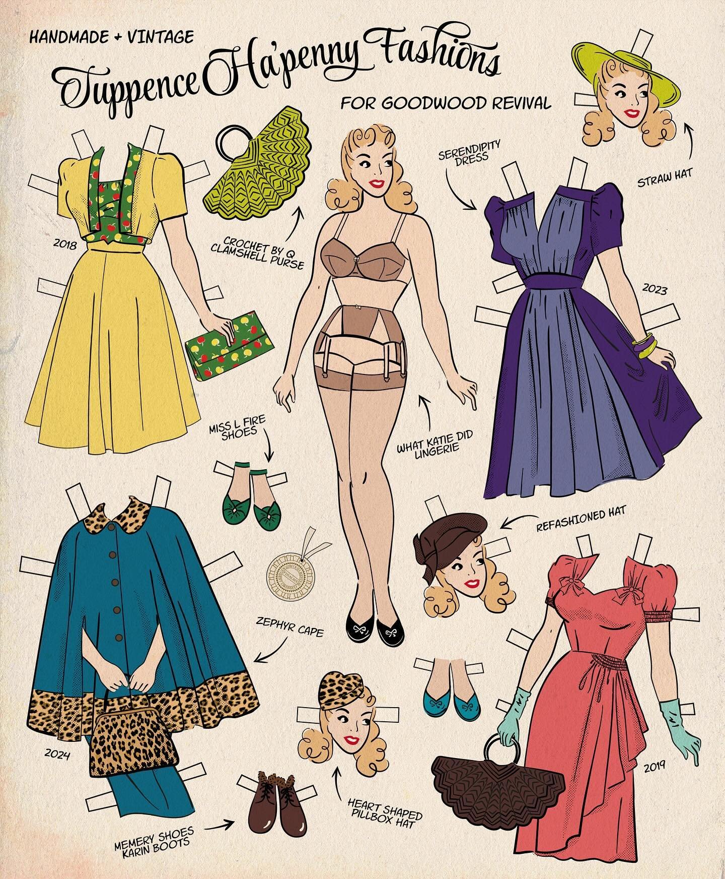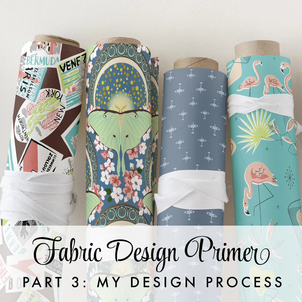
Most fabric design tutorials focus on how to design fabric rather than how to design fabric. In this blog series I’m sharing what I’ve learned from years of studying, reproducing and creating fabric designs, and hope that the knowledge I’ve gained through trial and error will be helpful to you. Today I’m talking about my own process, and I’ll go into detail about how I get started on a new project. While I don’t have a specific set process that I always follow, many of my designs involve some similar steps. I’ve talked a bit in the past about my development process for specific fabrics including Ballerina Garden, Butterfly Mail and Santorini Architecture, which illustrate some different variations to my approach.
Developing the Concept
Sometimes I have a clear idea in my head from the start; sometimes I start with a rough concept and build it up piece by piece, playing with different variations along the way. The initial idea might stem from anywhere: a specific vintage print that I want to reproduce directly, a vintage print or illustration that sparks my imagination, a Spoonflower design challenge prompt, or an idea to add a new print to an existing design collection - often it’s some combination of these!
The inspiration can be quite direct, as in my reproduction or semi-reproduction prints, or I might draw together various elements and sources.
Gathering Inspiration
Once I have an idea in mind, I begin my research. One thing all my designs have in common is that I always draw from original vintage sources. I’ll look for examples of vintage fabrics or wallpapers on the theme I’m working on, along with photographs and vintage illustrations. When I’m planning a new design, I start by developing a Pinterest mood board of inspirations to work from.

Pinterest board for my Rococo Porcelain design
Creating the Elements
Once I’ve built my library of inspiration images it’s time to start assembling the motifs. Sometimes I sketch on paper first as with my Santorini Architecture print, but usually I undertake the whole process from start to finish in Adobe Illustrator.
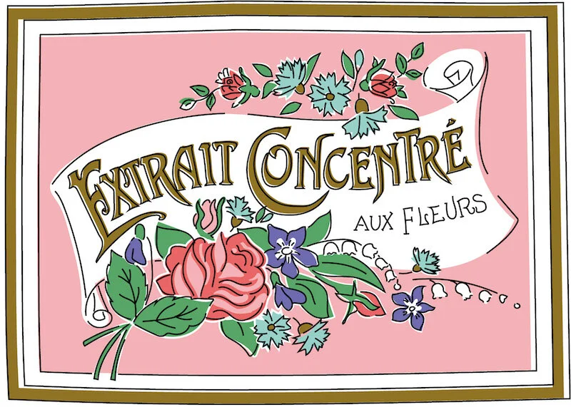
I am not a natural artist, so a lot of my illustrations are overdrawn from source images, which might be photographs, vintage fabrics, vintage magazine illustrations, or product labels. When bringing together disparate inspirations, it’s important to adapt them into a uniform illustration style and colour palette to ensure a consistent overall feel. I usually employ a fairly limited colour palette to mimic the style of vintage prints, so it helps to ensure that I’m designing with that constrained palette in place from the start.

From original vintage beauty label to limited-palette vector graphic

The burlesque dancers in Balloon Dance were based on photographs and vintage illustrations.
Getting the Vintage Feel
One way I evoked the feel of vintage novelty prints on my Parfumerie design was to give areas of colour a white outline, and slightly offset the in-fill colour from the black outlines. This mimics the look of vintage printing methods, where each colour would be applied separately and is usually ever so slightly misaligned. It also helps to give more depth to the images.
This label used flowers duplicated from other parts of the pattern I had already completed - re-using elements saves time and effort, and ensures a consistent look
Laying Out the Repeat
Having developed the design elements, the next step is to arrange the layout. In part 2 of this series, Perfecting Your Patterns, I discussed the importance of designing with the repeat in mind. Accordingly, before I get to this stage I usually have some idea of the type of repeat layout I’m planning to go for (e.g. unstructured or aligned; scattered or directional). If the print I’m working on is inspired by one or more original vintage fabrics, I’ll often use those as a reference for the repeat configuration.
Even if I’m designing a new pattern from scratch, it can still be helpful to refer to other fabrics as I think about how to use my elements and get the focal points in proportion. Obviously, different motifs won’t necessarily map perfectly to the sizes and shapes on the original, but once I have a basic outline I can play around with the placement to get the balance right. I used this technique when I was developing my Vintage Vanity print, using Central Park in Springtime as a guide for placement of the design elements to get started: the lady at her dressing table maps to the focal point scene; perfume bottles replace the secondary scene; while lipsticks and scattered rosebuds function as background texture similarly to the daisies in the original. The final two designs are nothing alike, but the initial mapping was helpful as a starting point to develop the repeat.


Illustrator also has an incredibly useful function which automates the process of creating seamless pattern repeats, which has revolutionised my design process. When I first started, using more basic graphics software, I was creating my repeats manually: I had to determine the size of my pattern repeat rom the outset, and any change to the size of the design would entail painstaking repositioning of every single element. Illustrator’s pattern maker previews several repeats and automatically updates when you move items around. You can also resize the tile and play with different repeat configurations (basic, half-brick, half-drop etc.)

The background colour gets added later, behind the finished pattern
Developing Colourways
The final step is to finalise the design colours and background. Illustrator’s recolour tool is another huge timesaver here, making it quick and easy to experiment with different colourways. It can be really fun to see the difference a dark vs light background can make to the overall feel of a design.
I keep a ‘colour library’ with records of the exact shades I’ve used in other prints / design collections, so that when I want to create a coordinating design I can re-use the same colour palette.

I hope this walk through my design process was helpful! Let me know in the comments if you have any questions!